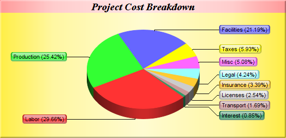
This example demonstrates the "side label layout" method for positioning the sector labels. It also demonstrates metallic background colors, and sector labels with glass shading effect and rounded corners.
With "side label layout", the sector labels are positioned on the left and right sides of the chart. In contrast, all previous examples use "circular label layout", in which the labels are positioned circularly around the pie.
"Side label layout" has the advantages that the labels will automatically shift up and down to avoid overlapping. In the above chart, there are a number of small sectors at the bottom-right of the pie. Note that the labels are shifted to avoid overlapping.
- The golden background is achieved by using goldColor to create the golden color, then use it in PieChart.PieChart as the chart background color.
- Similarly, the pink metallic background for the chart title is achieved by using metalColor to create the pink metallic color, then use Box.setBackground of the title TextBox object to set it as the background color.
- The side label layout method is specified with PieChart.setLabelLayout.
- The glass shading effect of the sector labels is defined using glassEffect, then applied to the sector labels using Box.setBackground of the sector label prototype object (obtained via PieChart.setLabelStyle).
- The rounded corners of the sector labels are configured using Box.setRoundedCorners of the sector label prototype object.
If the data have a lot of small values and are sorted, the small sectors will be crowded together. For these cases, label layout will be optimal (with the least shifting required) if the small sectors are at the left or right side of the pie, rather than at the top or bottom.
If the data are in descending order (like this example), a start angle of 135 degrees with clockwise sector layout can be used to put the small sectors at approximately 45 - 135 degrees (the right side of the pie). If the data are in ascending order, a start angle of 45 degrees with clockwise sector layout can be used to achieve similar effects.